 Thanks for connecting!


Arushi Mathur
5 min read
May 4, 2023


Table of Contents
Today we're unveiling our new identity. While the Oneistox brand has been around for over three years and many have come to love and appreciate it (despite the initial and inevitable stutterings in pronouncing it), we are excited to tell you, our lovely audience, about why we decided to move on from it.
A Little Background
When the idea of setting up a platform to help architects and engineers prosper first came to us, we wondered what term/phrase could possibly encapsulate our ambition for this community. We sought inspiration from something close to home. You see, architectural models are built to scale. The scale of an architectural model is a ratio - in other words, the relative size of the model to the real thing. For example, a model at 1:1 scale would be a life size model, whereas one at 1:10 scale would be one tenth of its actual size.
So we decided to call ourselves “oneistox” or 1:X, where “x” denotes a variable. It came to be a signifier of exponential growth, unlimited opportunity, and unbridled optimism for the future of the AEC community. Being true to our name, we did our best to embody the infinite that we believed in. We had one goal—to do whatever it takes to propel architects and engineers towards tech-first skills and ensure better career opportunities for them.
But then, our dream got bigger.
Ever heard about the Technology Adoption Curve by sociologist Everett Rogers? It’s a riveting concept that describes the stages of technology adoption. It always starts with the innovators, who are tech enthusiasts and who create new concepts. They are followed by the early adopters, who are visionaries and help transform new concepts into reality. The early and late majority come next, who prefer technology to be tried and tested before adopting it completely. And finally, the laggards, who are always sceptical of new technologies and hence are never able to extract their full benefits.
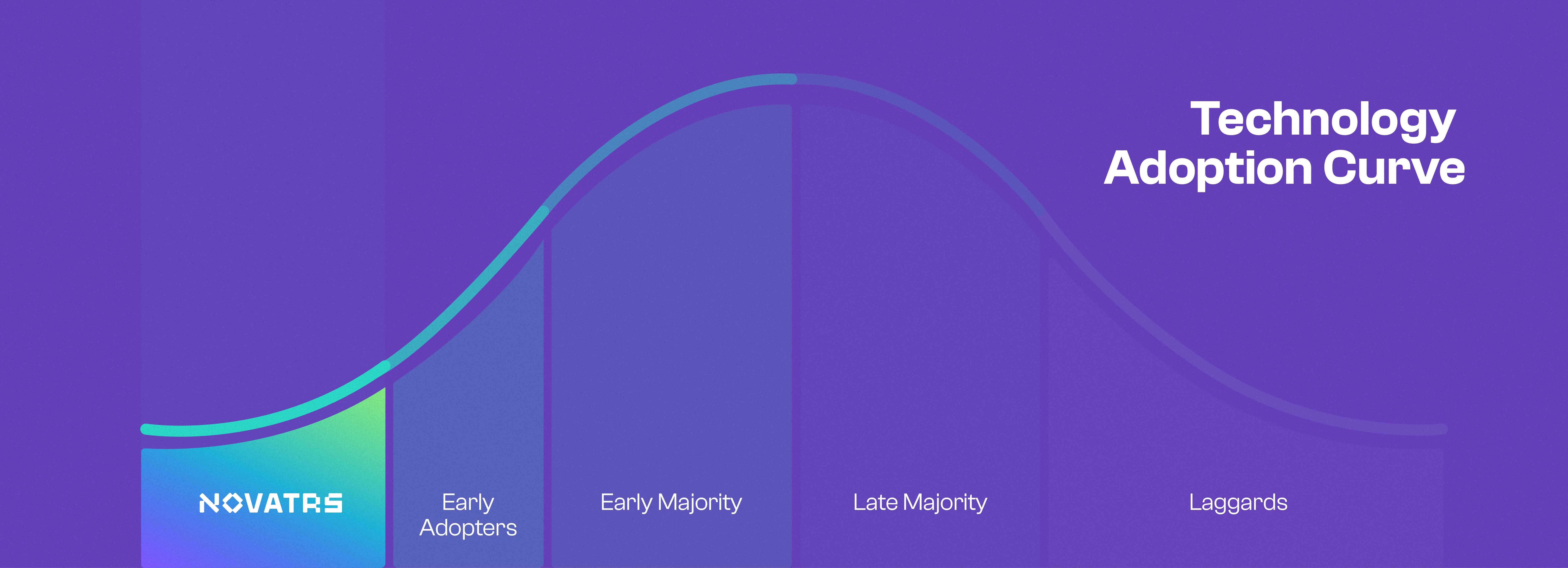 It's time to call ourselves what we really are – innovators.
Oneistox was always a part of the innovators. We just lacked the self-awareness to call ourselves that. But now that we’re older and our vocabulary, both scientific and literal, has improved, it’s time to call ourselves what we really are – innovators.
Also read: From the Founders’ Desk: Our Journey So Far
An Iconic Makeover
What’s in a name? Well, a lot (sorry, Shakespeare)! And what’s in a logo? Why only the collective dreams and emotions of the community that identifies with it, of course!
We live in a world where the current brand landscape is littered with ill-conceived, undercooked, and one-note brand logos and visuals. The lack of detail and visual recognisability and the tonal mismatch in the start-up space are some of the reasons why brands are unable to make an impression on their users and eventually fall into obscurity. Paul Rand once said, “Design is the silent ambassador of your brand.”
We were convinced—Novatr’s visual language had to be a very vocal ambassador for a company that has a lot to say and show the world!
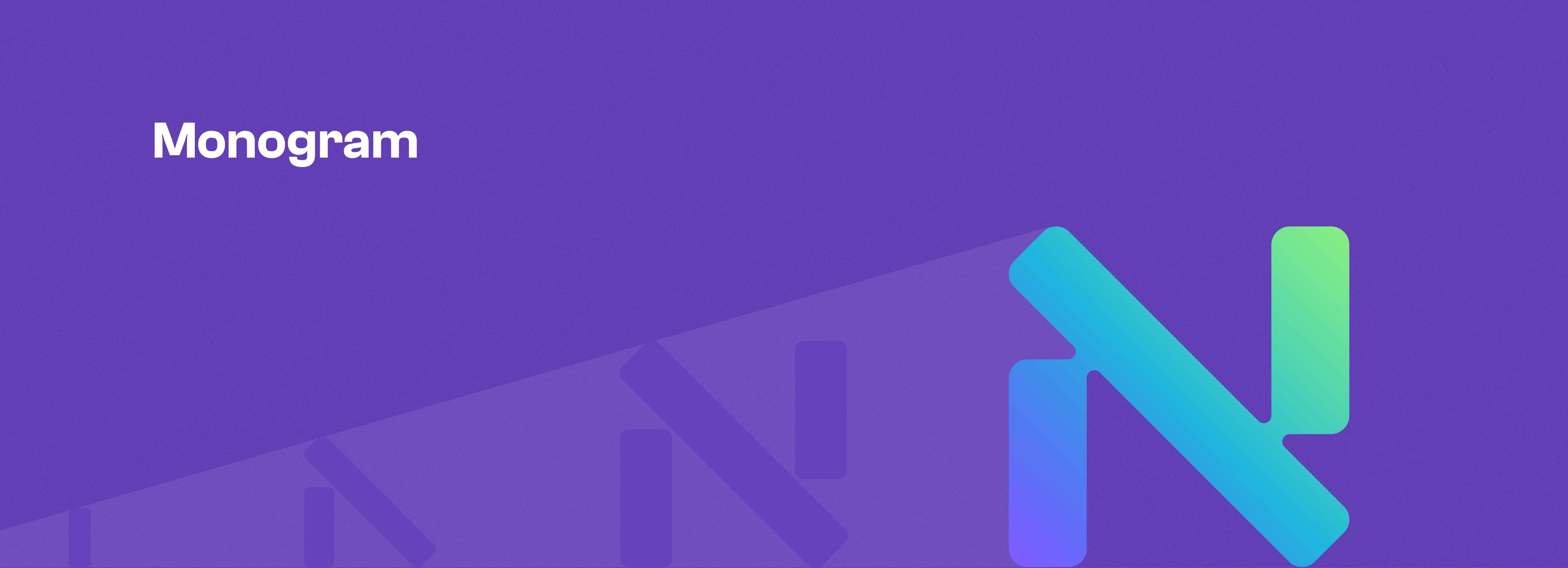
The Novatr logo is a bespoke wordmark, a typographic expression reflecting the brand and its ethos. Futuristic, forward-thinking and disruptive in nature. It is made of a custom-made typeface which adds to its uniqueness in the branding design space. It plays with rounded corners as well as straight lines that merge at a specific point to draw back to “bridging the innovation gap”. Bold shapes that indicate confident, bullish innovation with a sense of approachability and dynamism.

The various unique letterforms represent endless possibilities, differentiation, and change. While a few elements in the logo take the expected form, a few others are unconventional. These glyphs are constructed organically from shapes that resemble building blocks, harkening back to the company’s roots and ever-growing community.
On the whole, the logo reflects a balance between integrity, sincerity, innovation, and edginess. The kind of qualities seen in disruptors and pioneers seeking a shift in the industry landscape.
A bright, resplendent colour palette has been used in the form of liquid gradients that smoothly transition between analogous colours. A special focus is drawn to the fluidity in the design, something that impacts the design language of the company from top to bottom. Design elements and shapes used also contain the same gradients, seamlessly blending in and creating focal points to subtly grab the attention of the user.
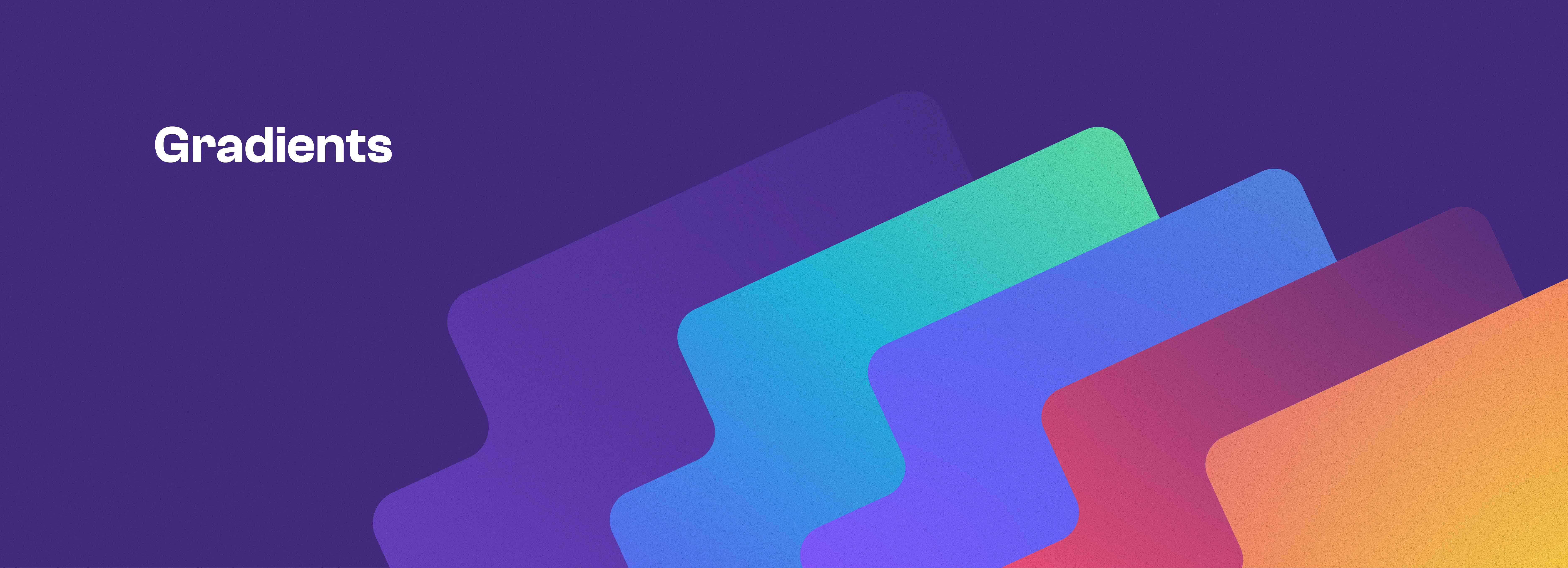
Why gradients you ask? Gradients are a very versatile design motif. They can be used as highlights but also as background elements. The new colour palette, with those bright gradient colours, is optimised for digital use, a sign of Novatr’s tech-first approach to education and innovation. They also inject a sense of energy and dynamism into the brand’s visuals.
It is a departure from the stifling flat design style that is currently being used by brands. Gradients serve as memorable visual devices to introduce Novatr and to usher in a new age for the AEC industry.
The use of purple as our primary colour to imply creativity and imagination is a semiotic strategy that draws on the colour’s cultural associations and psychological effects. Purple’s relative rarity in nature makes it stand out and catch the eye, which can be seen as imaginative or innovative in a visual context.
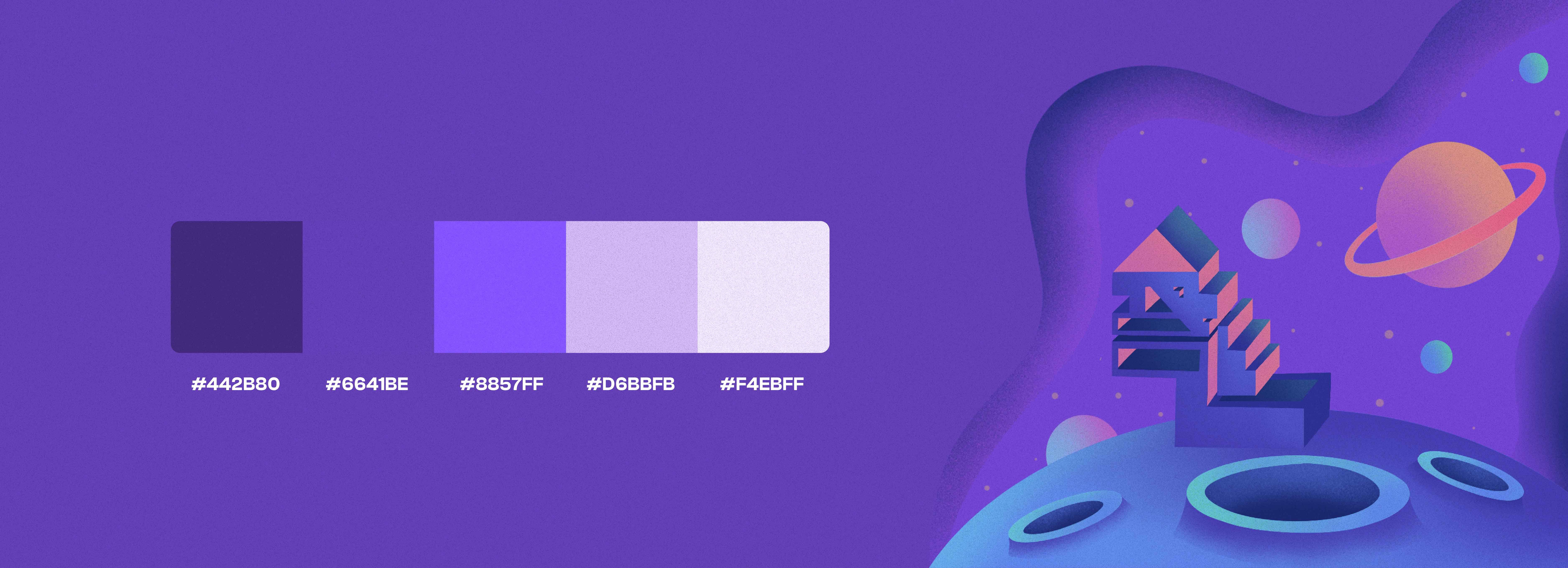
Additionally, purple has historically been associated with creative pursuits, such as art and design, and has more recently been associated with technology due to the digital nature of the colour and the connotations of "cyberspace". The colour purple is also associated with royalty and nobility, and can therefore convey a sense of sophistication and exclusivity. By using purple in our branding, we hope to posit ourselves as forward-thinking and innovative.
Also read: We've Renamed and Rebranded. What's Next?
What’s Next?
This is not just a mere facelift; it’s a whole new vibe that promises to captivate and inspire. With a fresh new name, typeface, logo, and colours, we feel like we’re exuding some serious main character energy. Over the next few months, you’ll watch Novatr leave no stone unturned in its quest for rebranding glory. All our other visuals, from the website to socials to advertising collateral, will transform to align around this direction.
Buckle up AEC, it’s time for Novatr! ⚡
.png)